Table of Contents
TogglePicking paint colors for a living room isn’t just about what looks good on a chip, it’s about setting the tone for the most-used space in the home. Modern living room colors in 2026 lean heavily on balance: grounded neutrals that feel anything but boring, earthy warmth that mimics natural materials, and strategic pops of bold, saturated hues. Homeowners and DIYers are moving away from stark whites and predictable grays, favoring layered palettes that add depth without overwhelming the eye. Whether repainting a single accent wall or committing to a full room transformation, understanding current color trends and how they interact with light, furniture, and finish materials makes the difference between a room that feels dated and one that holds up for years.
Key Takeaways
- Modern living room colors in 2026 prioritize layered, tone-on-tone palettes and biophilic designs inspired by nature rather than single-statement bold walls.
- Greige, warm taupe, soft whites with depth, and muted earth tones like sage and terracotta are replacing stark whites and cool grays as the foundation of contemporary color schemes.
- Dark, saturated hues—charcoal, forest green, and navy—work effectively in larger rooms with ample natural light or high ceilings to create sophisticated depth without feeling cramped.
- Always test paint samples directly on your walls in multiple lighting conditions for at least 48 hours before committing, as colors shift significantly between store displays and your actual home.
- Strategic accent colors on trim, molding, built-ins, and ceilings add visual interest and sophistication without overwhelming the space like traditional accent walls.
- Proper prep work, including primer application and surface preparation, combined with matte or eggshell finishes, ensures modern living room color choices remain timeless and durable for years.
What Defines Modern Living Room Color Schemes in 2026?
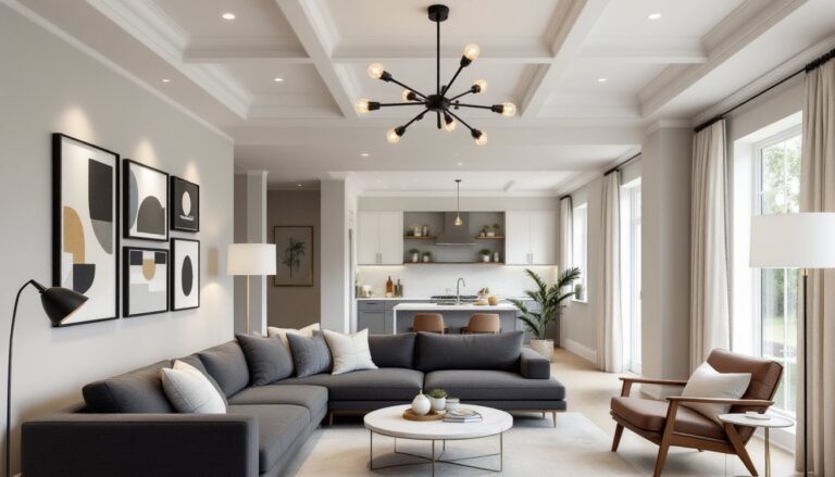
Modern color palettes in 2026 prioritize layering and texture over single-note statements. Instead of one wall color doing all the work, successful schemes combine a dominant hue with complementary trim, ceiling, and accent tones. The shift reflects a broader design trend: living rooms double as work-from-home offices, casual dining areas, and media rooms, so colors need to perform under various lighting conditions throughout the day.
Key characteristics include:
- Low-contrast layering: Tone-on-tone schemes using variations of the same color family (e.g., three shades of taupe from walls to trim to ceiling)
- Biophilic influence: Colors inspired by natural landscapes, terracotta, clay, moss, stone, that pair well with wood tones and organic textiles
- Matte and eggshell finishes: Flat or low-sheen paints dominate walls, reducing glare and lending a softer, more sophisticated look than the satin finishes popular a decade ago
- Intentional contrast points: Rather than loud accent walls, designers use color on architectural details, door frames, built-ins, window casings, to add visual interest
This approach works especially well in open-concept homes where the living room flows into adjacent spaces. Cohesive color transitions prevent jarring breaks and make smaller square footage feel larger.
Top Neutral Color Palettes for Contemporary Living Rooms
Neutrals remain the backbone of modern living rooms, but the palette has evolved. Cool grays are giving way to warmer, more complex tones that read differently depending on natural light.
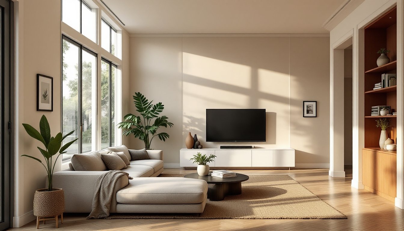
Greige and warm taupe: A blend of gray and beige, greige anchors contemporary spaces without feeling cold. Shades like SW Accessible Beige or BM Revere Pewter adapt to both north- and south-facing rooms. Pair with white oak flooring and linen upholstery for a cohesive, timeless look.
Soft whites with depth: Pure white (especially builder-grade whites) can feel sterile. Instead, opt for whites with subtle gray, cream, or even blush undertones, BM Simply White or SW Alabaster, that provide enough warmth to prevent the room from feeling clinical. These work particularly well in rooms with abundant natural light.
Mushroom and putty tones: Mid-tone neutrals in the 50–60 LRV (light reflectance value) range offer depth without drama. These colors ground large sectionals and media centers while keeping the space feeling open. Test samples in multiple lighting conditions: what looks beige at noon might read pink under incandescent bulbs.
Application tips: Use a primer formulated for your wall surface, drywall, plaster, or previously painted surfaces each require different prep. One gallon of quality paint typically covers 350–400 square feet per coat, but textured walls or bold color changes may require a second coat. Always cut in edges with a brush before rolling to ensure clean lines at trim and ceilings.
Bold and Moody: Dark Color Trends Taking Over Modern Spaces
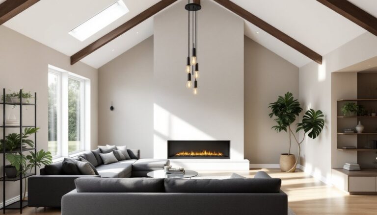
Dark walls are no longer reserved for dining rooms or powder baths. Deep, saturated hues create intimacy and drama in living spaces, especially effective in larger rooms where light walls can feel cavernous.
Charcoal and slate: Near-black grays add sophistication without the starkness of true black. These tones work best in rooms with ample natural light or high ceilings (9 feet or taller), where the darkness won’t make the space feel cramped. Pair with brass or matte black hardware, and use lighter furnishings to prevent a cave effect.
Forest green and deep teal: Rich jewel tones bring unexpected warmth. Dark greens (think SW Evergreens or similar) complement natural wood trim and leather furniture. Teal leans slightly cooler and pairs well with chrome fixtures and gray textiles.
Navy and midnight blue: A classic that feels fresh when paired with warm wood tones and creamy whites. Navy reads almost neutral in low light but shows its true color in daylight. It’s particularly effective on a single focal wall behind a sofa or entertainment center.
Execution considerations: Dark paints amplify surface imperfections. Patch nail holes with spackle, sand smooth with 120-grit sandpaper, and use a tinted primer to reduce the number of topcoats needed. Expect to apply two to three coats for even coverage, especially over lighter existing paint. Matte finishes hide flaws better than satin but are harder to clean, consider eggshell in high-traffic living rooms.
Warm Earthy Tones That Bring Natural Elegance
Earthy palettes dominate 2026 interiors, reflecting a broader shift toward biophilic design, bringing the outdoors in through color, texture, and material.
Terracotta and clay: Warm, burnt oranges and soft reds add richness without reading as loud or trendy. These hues pair beautifully with natural fiber rugs (jute, sisal), rattan furniture, and matte black metal accents. They’re especially effective in rooms with south- or west-facing windows where warm afternoon light intensifies the color.
Sage and olive: Muted greens feel organic and calming. Sage works well in modern farmhouse or transitional styles, while deeper olive tones suit mid-century or industrial aesthetics. Both colors are forgiving, they hide minor scuffs and don’t show dirt as readily as lighter neutrals.
Warm beige and sand: Unlike the cool beiges of the 2010s, modern beiges have yellow or pink undertones that feel grounded and inviting. These colors serve as excellent backdrops for bold artwork or colorful textiles. They also complement a wide range of flooring, from light maple to dark walnut.
Prep and application: Earth tones can shift dramatically under different lighting. Paint test swatches (at least 2′ x 2′) on multiple walls and observe them at different times of day. For the best color accuracy, use a high-quality 100% acrylic latex paint with a low- or zero-VOC formula, important for enclosed living spaces. Allow proper dry time between coats (typically 4 hours minimum, longer in humid climates).
How to Choose the Right Color Palette for Your Living Room
Selecting a modern color scheme requires balancing personal preference with practical considerations, room size, natural light, existing finishes, and furniture.
Assess natural light: North-facing rooms receive cooler, indirect light: warm tones (beige, terracotta, soft yellow) counteract the chill. South-facing spaces get warm, direct sun and can handle cooler grays, blues, or greens without feeling cold. East- and west-facing rooms shift throughout the day, test colors in both morning and afternoon light.
Consider existing finishes: Flooring, trim, and built-ins influence how wall colors read. Honey oak trim pairs poorly with cool grays but works beautifully with warm neutrals or sage. If trim is painted white, ensure the wall color has compatible undertones, cool white trim with warm walls can clash.
Factor in ceiling height and room size: Dark colors work best in rooms with 9-foot or higher ceilings and ample square footage (200+ square feet). In smaller spaces (under 150 square feet), lighter tones or a single dark accent wall prevents the room from feeling closed in.
Test before committing: Purchase sample pots and paint large swatches directly on the wall, don’t rely on tiny paint chips. Live with the samples for at least 48 hours and view them under both natural and artificial light. Colors can shift significantly between the store and your home.
Match the style: Modern minimalist spaces lean toward monochromatic neutrals with subtle contrast. Transitional or eclectic styles allow for more adventurous pairings, earthy base tones with jewel or terracotta accents.
Accent Colors and Contrast Techniques for Modern Impact
Strategic accent colors add personality without committing to a bold overall palette. Modern living rooms use contrast thoughtfully, on architectural features rather than random walls.
Painted trim and molding: Instead of the standard white, paint door frames, window casings, or crown molding in a contrasting shade, deep charcoal trim against warm beige walls, or soft black against pale sage. This technique adds definition and sophistication without overwhelming the space.
Built-in shelving and alcoves: Paint the interior of built-ins or recessed shelving in a darker or more saturated tone than the surrounding walls. A navy or forest green interior behind white shelves creates depth and highlights displayed objects.
Accent wall alternatives: Rather than painting an entire wall, consider a half-wall treatment (paint or paneling from floor to chair rail height) or a vertical stripe behind a focal point like a fireplace or media console. Both options add visual interest without the commitment of a full accent wall.
Ceiling color: The often-overlooked fifth wall. Painting the ceiling a shade or two darker than the walls (still in the same color family) adds coziness to large rooms with high ceilings. In smaller spaces, a lighter ceiling maintains openness.
Execution tips: Use painter’s tape (FrogTape or similar for clean lines) and remove it while the paint is still slightly tacky to prevent peeling. When painting trim, use a 2-inch angled brush for precision. If painting both walls and trim, paint trim first, let it cure for 24 hours, then tape and paint walls.
Conclusion
Modern living room colors in 2026 reflect a shift toward intentionality, layered neutrals, nature-inspired earth tones, and strategic dark accents that add depth without sacrificing light. The best palette balances current trends with the realities of the space: natural light, existing finishes, and how the room actually gets used. Proper prep work, quality materials, and thoughtful testing ensure the color chosen today still feels right years down the line.