Table of Contents
TogglePicking the right paint color for a living room can make or break the entire space. Get it wrong, and the room feels cramped, cold, or just off. Get it right, and everything else, furniture, lighting, decor, clicks into place. But with thousands of color chips at the paint store and conflicting advice online, the decision gets overwhelming fast. The good news? There’s a practical method to narrow it down. This guide covers how to choose colors that work with natural light, architectural features, and personal style, plus the trending shades and neutrals that are holding strong in 2026.
Key Takeaways
- Natural light direction—north, south, east, or west-facing—significantly affects how paint colors read on walls, so assess your room’s light patterns before selecting a shade.
- Neutral paint colors like warm whites, greiges, soft grays, and taupes provide timeless versatility, while bold hues like deep blues and forest greens add personality when balanced with the room’s architecture.
- Test paint samples on actual walls under multiple lighting conditions (morning, afternoon, evening, and artificial light) for at least three days to avoid costly color mistakes.
- Trending paint colors for 2026 include earthy greens, warm terracottas, muted dusty blues, and moody browns, though personal preference and existing finishes should always take priority over trends.
- Room size and function determine the best paint color strategy—smaller spaces benefit from lighter tones to feel open, while larger rooms can handle darker, cozier shades.
- Ensure proper contrast between wall paint and trim color (typically two to three shades apart) so architectural details remain visible rather than blending into the background.
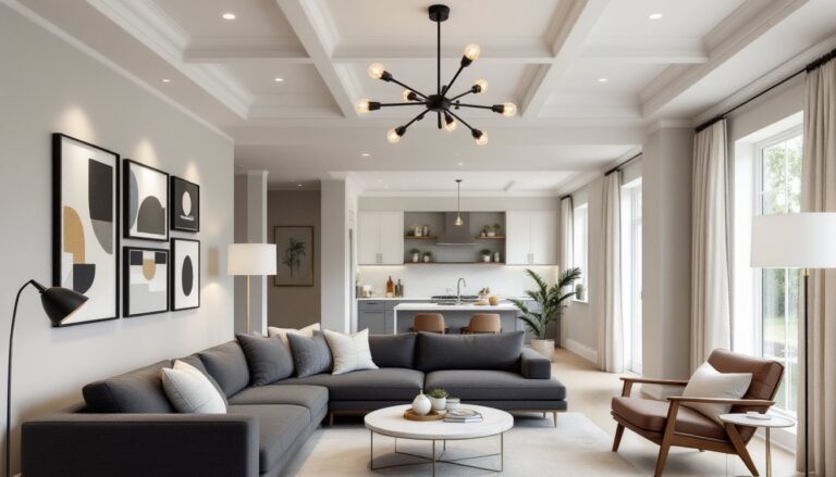
How to Choose the Right Paint Color for Your Living Room
Before touching a paintbrush, assess the room’s bones. Start with natural light, is it a north-facing room that stays cool and dim, or a south-facing space flooded with warm sun? Light direction shifts how color reads on the wall. Cool light amplifies blues and grays: warm light intensifies reds and yellows.
Next, consider existing fixed elements. Flooring, built-ins, brick fireplaces, and trim don’t change easily. The paint needs to complement these, not fight them. If there’s oak trim with orange undertones, a cool gray might clash. A warmer greige or taupe works better.
Room size and ceiling height matter, too. Darker colors can make a large room feel intimate but will shrink a small space. Light colors bounce light around and open things up. A 10×12-foot living room benefits from lighter tones, while a spacious great room can handle deeper hues without feeling closed in.
Finally, think about function and mood. A living room used for movie nights and relaxing can go darker and cozier. One that doubles as a playroom or workspace might need brighter, more energizing tones. The right color reflects how the space gets used.
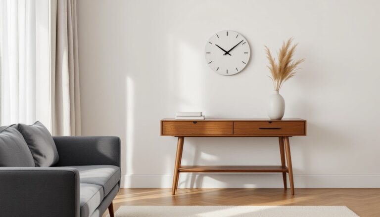
Best Neutral Paint Colors for Living Rooms
Neutrals remain the workhorse of living room design, they’re timeless, versatile, and easy to layer with other colors and textures. But neutral doesn’t mean boring or beige.
Warm whites like Swiss Coffee or Alabaster offer softness without the stark glare of pure white. They pair well with natural wood tones and brass fixtures, making them ideal for modern farmhouse or transitional styles.
Greiges (gray-beige hybrids) such as Agreeable Gray or Revere Pewter bridge the gap between cool and warm. These chameleon shades shift slightly depending on light and surrounding colors, which makes them flexible but requires testing in the actual space.
Soft grays like Classic Gray or Stonington Gray lean cooler and work in contemporary settings with stainless steel, chrome, or black accents. They read cleaner and more modern than beige but can feel cold in rooms with limited natural light.
Taupes and warm beiges like Accessible Beige or Kilim Beige ground a room without overwhelming it. They’re particularly effective in living rooms with leather furniture, woven textiles, or warm-toned hardwood floors.
When selecting neutrals, test them against your trim color. Most builders use a standard white or off-white trim. If the wall color is too close in tone, the trim disappears. If it’s too far off, the contrast can look harsh. A difference of two to three shades usually strikes the right balance.
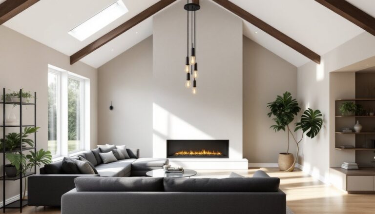
Bold and Dramatic Living Room Paint Colors
Bold colors demand confidence, but they deliver personality and depth that neutrals can’t match. The key is balancing intensity with the room’s architecture and furnishings.
Deep blues like naval or hale navy create a sophisticated, library-like atmosphere. They work especially well in rooms with white trim, crown molding, or wainscoting. Pair them with brass or gold hardware for a classic look, or matte black fixtures for something more modern.
Forest greens and emeralds bring richness without feeling heavy. These colors trend well in 2026 and suit living rooms with natural textures, linen, jute, wood, and greenery. They’re grounded enough for traditional spaces but fresh enough for contemporary ones.
Charcoal and near-black shades like Kendall Charcoal or Iron Ore anchor a room and highlight architectural details. They’re dramatic without being loud. Use them in rooms with ample light, high ceilings, or large windows to avoid a cave effect.
Warm terracottas and burnt siennas add earthy warmth and pair beautifully with Mediterranean, boho, or midcentury styles. These colors work best as accent walls or in rooms with cooler-toned furnishings to balance the heat.
When going bold, limit the palette. One or two feature walls often work better than painting the entire room. And don’t forget the ceiling and trim, keeping those lighter maintains balance and prevents the space from feeling too enclosed.
Trending Paint Colors for Living Rooms in 2026
Color trends evolve, but 2026 leans toward grounded, nature-inspired tones and soft, complex neutrals.
Warm, earthy greens continue their run from previous years, but the shades are getting richer, think olive, sage with gray undertones, and mossy greens. These bring calm and work across design styles.
Warm terracottas and clay tones are gaining traction, especially in spaces aiming for a warmer, more organic feel. They pair well with natural materials and neutral furniture.
Soft, muted blues, not the crisp navies of past years, are showing up more. Dusty blue-grays and slate tones offer serenity without feeling cold, especially in rooms with warm wood or textured fabrics.
Creamy off-whites with pink or yellow undertones are replacing stark whites and cool grays. These shades feel more inviting and read warmer in natural light, which aligns with the shift away from ultra-modern minimalism.
Moody, saturated browns, chocolates, deep taupes, and espresso tones, are making a comeback as statement colors. They bring richness and a sense of coziness without the starkness of black.
Trends are helpful for narrowing options, but they shouldn’t override the home’s architecture or the homeowner’s taste. A trendy color that clashes with existing finishes or feels out of place won’t age well, even if it’s popular now.
How Lighting Affects Your Living Room Paint Color
Lighting is the single biggest factor that changes how paint reads on a wall. The same color looks different at 9 a.m., 3 p.m., and 8 p.m., and it shifts again depending on bulb type.
Natural light varies by direction. North-facing rooms get cooler, indirect light that can make colors look more muted or gray. Warmer tones, beiges, creams, soft yellows, help counteract that coolness. South-facing rooms receive strong, warm light throughout the day, which intensifies colors. Blues, greens, and cooler grays hold up well here. East-facing rooms get warm morning light that fades to cooler light by afternoon. West-facing rooms do the opposite.
Artificial lighting matters just as much. Incandescent bulbs (now largely phased out but still in some homes) cast a warm, yellowish light that makes whites look cream and cools down blues. LED bulbs come in a range of color temperatures, measured in Kelvin. Bulbs in the 2700K–3000K range (soft white) mimic incandescent warmth. 4000K–5000K bulbs (cool white or daylight) cast a bluer light that makes warm colors look dull and cool colors pop.
Test paint samples under all lighting conditions, morning, midday, evening, and with the lights on. A color that looks perfect at noon might feel dingy under evening lamplight.
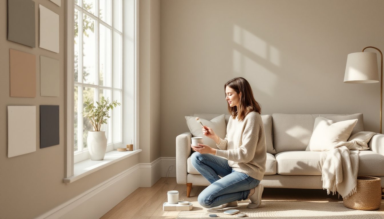
Tips for Testing Paint Colors Before Committing
Never choose a color based on a tiny chip alone. Paint looks different at scale and under real lighting conditions.
Buy sample pots of any color under consideration. Most brands sell 8-ounce samples that cover roughly 16 square feet, enough to paint a sizable test area.
Paint test patches directly on the wall, not on poster board. Board doesn’t reflect light the same way drywall does. Paint at least a 2×2-foot section in multiple spots around the room, one near a window, one on a wall that doesn’t get direct light, and one adjacent to the trim or other fixed elements.
Apply two coats. One coat of tester won’t give an accurate read of the final color, especially with lighter shades.
Live with the samples for at least three days. Observe them in morning light, afternoon sun, and under artificial light at night. Colors shift more than most people expect.
Compare undertones by placing samples next to flooring, furniture, and trim. A greige that looks neutral on its own might pull pink next to gray tile or green against oak.
Use primer if testing on a dark or brightly colored wall. Existing color bleeds through and skews the test. A coat of white or tinted primer gives a clean slate. Most interior primers cover 350–400 square feet per gallon on smooth drywall.
If still uncertain after testing, go lighter. It’s easier to add depth with furnishings and accents than to lighten a room that feels too dark or heavy.
Conclusion
Choosing a living room paint color comes down to understanding the room’s light, architecture, and function, then testing thoughtfully before committing. Neutrals offer flexibility and longevity, while bold colors add character and depth. Trends can spark ideas, but the best choice is one that feels right in the actual space, under real conditions, day and night. Take the time to test properly, and the result will be a room that feels intentional and lived-in, not like a gamble that didn’t pay off.