Table of Contents
ToggleBeige gets a bad rap for being bland, but warm beige is anything but boring when done right. It’s the workhorse neutral that anchors a room, plays well with nearly every accent color, and creates a cozy backdrop that won’t feel dated in three years. Unlike stark grays or pure whites, warm beige, those hues leaning toward honey, sand, and taupe, brings natural warmth without the commitment of bold color. For DIYers planning a living room refresh in 2026, warm beige offers flexibility: it hides imperfections on textured walls, pairs seamlessly with both modern and traditional furnishings, and adjusts beautifully under different lighting conditions throughout the day.
Key Takeaways
- Warm beige living room ideas thrive on layering multiple shades, textures, and light sources rather than relying on a single beige tone to avoid a flat, monochromatic look.
- Choose warm beige undertones leaning toward honey, sand, or taupe to maintain visual warmth and consistency throughout the day under different lighting conditions.
- Mix at least three different fabric weights and textures—linen, wool-blend rugs, and velvet pillows—to create depth and visual interest in a neutral-dominated space.
- Anchor warm beige with strategic accent colors like terracotta, deep charcoal, sage green, or navy to prevent the room from feeling too soft or washed out.
- Layer three types of lighting (ambient, task, and accent) using 2700K–3000K bulbs to enhance warmth and prevent beige walls from appearing gray or sterile.
- Include at least 20–30% non-beige elements through dark wood, black metal hardware, and architectural details like white trim to create visual anchors and definition.
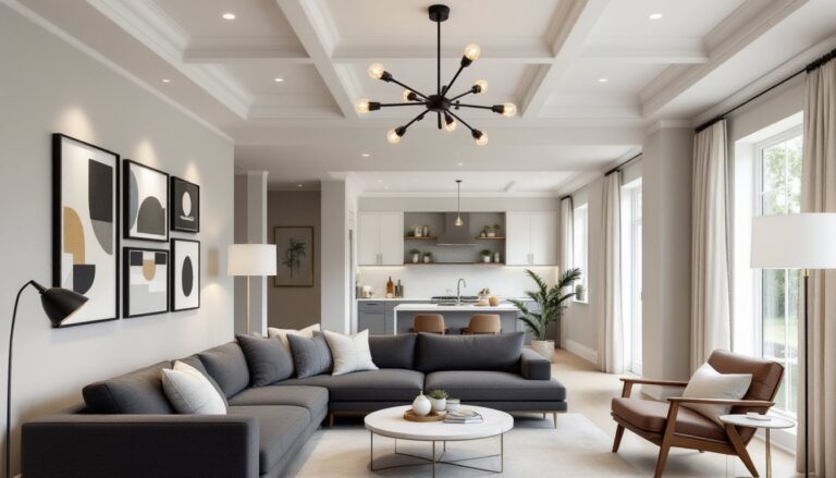
Why Warm Beige Is the Perfect Foundation for Your Living Room
Warm beige acts as a visual temperature control. It reads neutral enough to avoid overwhelming a space, but carries enough pigment, usually a mix of yellow, orange, or red undertones, to prevent that sterile, builder-grade feel.
From a practical standpoint, warm beige is forgiving. Drywall repairs, minor texture inconsistencies, and even slight color variations between paint batches blend in far better than with bright whites or deep saturates. Coverage per gallon typically ranges from 350–400 square feet depending on surface porosity, and most quality interior paints achieve full hide in two coats over properly primed drywall.
Warm beige also reflects light without creating harsh glare, a key consideration for living rooms with multiple windows or mixed natural and artificial light sources. Because it doesn’t shift dramatically under incandescent, LED, or daylight conditions, it maintains color consistency throughout the day, unlike cooler grays that can read blue or purple depending on the light source. For rooms with north-facing windows that receive cooler, indirect light, warm beige compensates by adding perceived warmth without requiring additional heat sources.
Layer Textures to Add Depth and Visual Interest
A monochromatic beige room fails when it lacks textural contrast. The solution isn’t more color, it’s more variety in surface finish and material.
Wall treatments set the stage. Consider these options:
- Flat or matte paint absorbs light and hides wall imperfections but shows scuffs easily, reserve it for low-traffic areas above chair rail height
- Eggshell or satin finishes offer subtle sheen and wipe clean with a damp cloth, ideal for main living room walls
- Textured plaster or skip trowel adds dimensional interest: apply over existing drywall with joint compound using a 6-inch taping knife
- Shiplap or tongue-and-groove paneling (actual dimensions: ¾” × 5½” for standard shiplap) creates horizontal lines that visually widen a room
Textile layers prevent flatness. Mix at least three different fabric weights and weaves:
- Linen or cotton slipcovers (washable, casual texture)
- Wool or wool-blend area rugs with visible weave patterns
- Velvet, chenille, or boucle throw pillows (catches light differently than flat weaves)
- Jute, sisal, or woven seagrass baskets for storage
For flooring, pair beige walls with materials that introduce natural grain: oak, hickory, or engineered hardwood in medium to warm tones. If installing new flooring, remember that engineered hardwood needs ⅜-inch expansion gaps around the perimeter and should acclimate in the room for 48–72 hours before installation. Luxury vinyl plank (LVP) offers similar visual warmth with better moisture resistance for high-traffic areas.
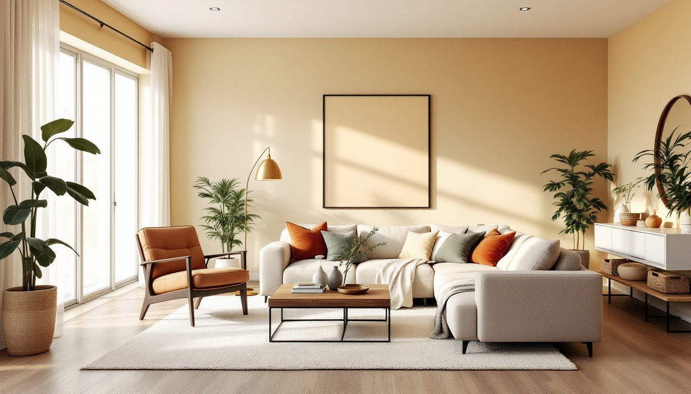
Accent Colors That Complement Warm Beige Beautifully
Warm beige pairs with a wide spectrum, but certain combinations feel more intentional than accidental.
Earthy terracotta and rust create a grounded, organic palette. Use these in textiles, throw pillows, woven wall hangings, or clay pottery, rather than large furniture pieces that limit flexibility. Terracotta especially works well in living rooms with abundant natural light, as it intensifies in brightness near windows.
Deep charcoal and black anchor a beige room and prevent it from feeling too soft. Introduce these through metal curtain rods, picture frames, or a black steel fireplace surround. Matte black hardware (cabinet pulls, light switch plates) adds definition without the high-gloss look of oil-rubbed bronze.
Sage green and olive bring in nature without the stark contrast of emerald or forest green. These work particularly well as accent wall colors (one gallon covers approximately 400 square feet) or in large upholstered pieces like a sectional sofa.
Navy and indigo provide a classic, sophisticated contrast. Since these are cooler tones, balance them with warmer beige shades that lean toward caramel or oat rather than gray-beige. Navy works well in rooms with southern exposure where natural warmth is already abundant.
Blush pink and soft coral soften a beige room without adding too much femininity. Use sparingly in artwork or a single accent chair. These hues show up differently under LED versus incandescent bulbs, test samples in your actual lighting conditions before committing.
Furniture and Decor Choices for a Cohesive Beige Living Room
Furniture selection should balance visual weight and proportion, especially in a neutral-heavy room where pieces don’t have color to distinguish them.
Upholstered furniture in warm beige or complementary neutrals forms the core. Look for:
- Performance fabrics (Crypton, Sunbrella, or similar) if the room sees heavy use or pets, these resist stains and clean with water-based solutions
- Slipcovered options for easy washing and seasonal changes
- Tight-back construction rather than loose cushions for a cleaner silhouette in modern spaces
- Visible wood frames in walnut, oak, or teak to break up upholstered mass
Wood furniture finishes matter more in monochromatic rooms. Medium to warm wood tones (honey oak, walnut, pecan) enhance the warmth. Avoid pickled or whitewashed finishes unless aiming for a coastal or Scandinavian look, those read cooler and can clash with warm beige.
Metal accents introduce contrast. Brushed brass, aged bronze, and matte gold feel warmer than chrome or polished nickel. For DIY projects like refinishing a coffee table, use oil-rubbed bronze spray paint (Rust-Oleum or Krylon) in light coats, 10–12 inches from the surface, allowing 15 minutes between passes.
Decor layers tie the room together:
- Oversized mirrors with wood or metal frames (reflect light and expand space)
- Woven baskets in varying sizes for functional storage
- Live plants in ceramic or terracotta pots (snake plants and pothos tolerate low light)
- Books, ceramics, and objects in accent colors clustered in odd-numbered groups
Avoid matching furniture sets. Mix eras, materials, and silhouettes for a collected-over-time feel.
Lighting Strategies to Enhance Warmth and Ambiance
Lighting determines whether a beige room feels cozy or washed out. Layer at least three types of light sources at different heights.
Ambient lighting provides general illumination. For living rooms, calculate roughly 1.5–2 watts of LED per square foot. A 200-square-foot room needs 300–400 watts equivalent in total ambient lighting. Options include:
- Recessed cans (6-inch diameter) on dimmer switches, spaced 4–6 feet apart
- Flush-mount or semi-flush ceiling fixtures with fabric shades that diffuse light softly
- Track lighting aimed at walls to create indirect bounce light
Task lighting focuses on specific activities, reading, working, or hobbies. Use:
- Floor lamps with adjustable arms positioned beside seating
- Table lamps on end tables or consoles, ideally 58–64 inches from the floor to the bottom of the shade when seated
Accent lighting adds drama and depth:
- Picture lights above artwork or floating shelves
- LED strip lighting behind floating TV consoles or under shelving (install with adhesive backing on clean, dry surfaces)
- Uplights in corners to wash walls and lift ceilings visually
Bulb color temperature is critical. Choose 2700K–3000K (soft white to warm white) to reinforce the warmth in beige tones. Avoid bulbs above 3500K, they shift beige toward gray. If installing new fixtures, ensure electrical boxes are properly secured to studs or blocking: ceiling fans and heavy chandeliers require boxes rated for the weight and should be anchored to a joist or cross-brace, not just drywall.
Common Mistakes to Avoid When Designing with Beige
Even versatile beige can go wrong without attention to detail.
Using only one beige tone creates flatness. Combine at least two or three shades, lighter on walls, medium on large furniture, deeper on accents. Test paint samples on all four walls: beige shifts dramatically based on light exposure.
Skipping white trim is a missed opportunity. Crisp white baseboards, crown molding, and window casings (Benjamin Moore White Dove or Sherwin-Williams Pure White) frame beige walls and add architectural definition. If painting trim, use semi-gloss or high-gloss for durability and washability. Sand existing trim with 150-grit sandpaper, prime with a stain-blocking primer, and apply two finish coats.
Ignoring undertones causes clashing. Beige with pink undertones fights orange-based woods. Beige with green undertones looks muddy next to cool grays. Paint large poster boards (2′ × 2′) with sample colors and move them around the room over several days to observe how they behave in morning, midday, and evening light.
Overloading with beige leads to monotony. Introduce at least 20–30% of the room in non-beige elements, dark wood, black metal, saturated accent colors, to create visual anchors.
Neglecting maintenance shows up fast on light neutrals. Beige upholstery needs stain protection (Scotchgard or similar applied per manufacturer instructions). Beige walls in high-traffic areas benefit from scrubbable paint finishes (satin or eggshell) and touch-up paint kept on hand for scuffs.
Conclusion
Warm beige living rooms succeed when they balance color, texture, and light, not by playing it safe, but by layering intentionally. Start with the right beige undertone for the room’s light exposure, build in textural contrast through materials and finishes, and anchor the space with strategic accent colors and varied lighting. The result is a room that feels grounded, flexible, and genuinely inviting, not a showroom, but a space that works.